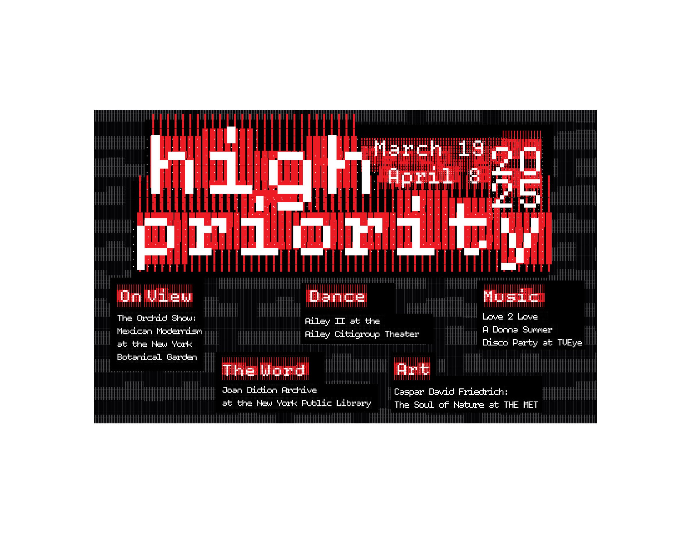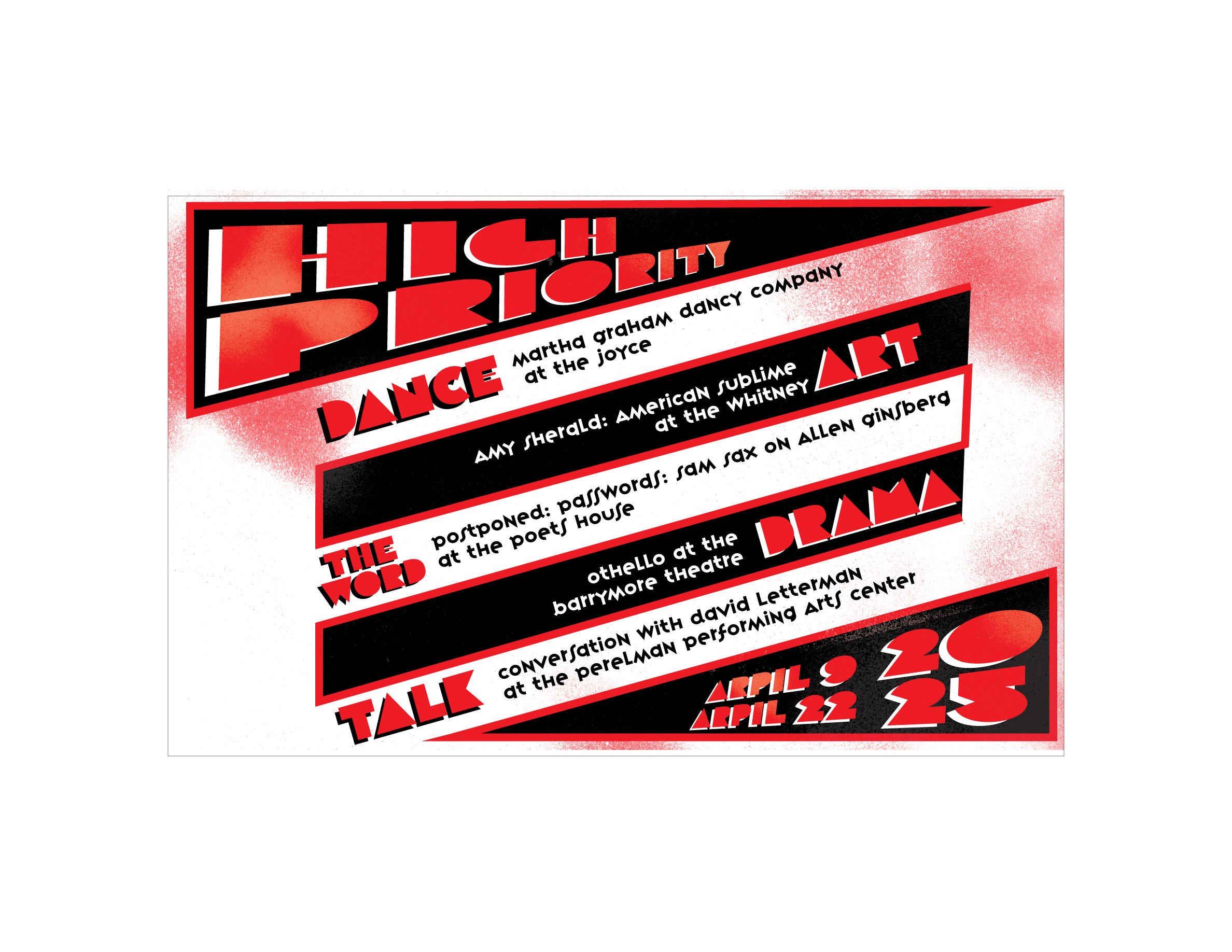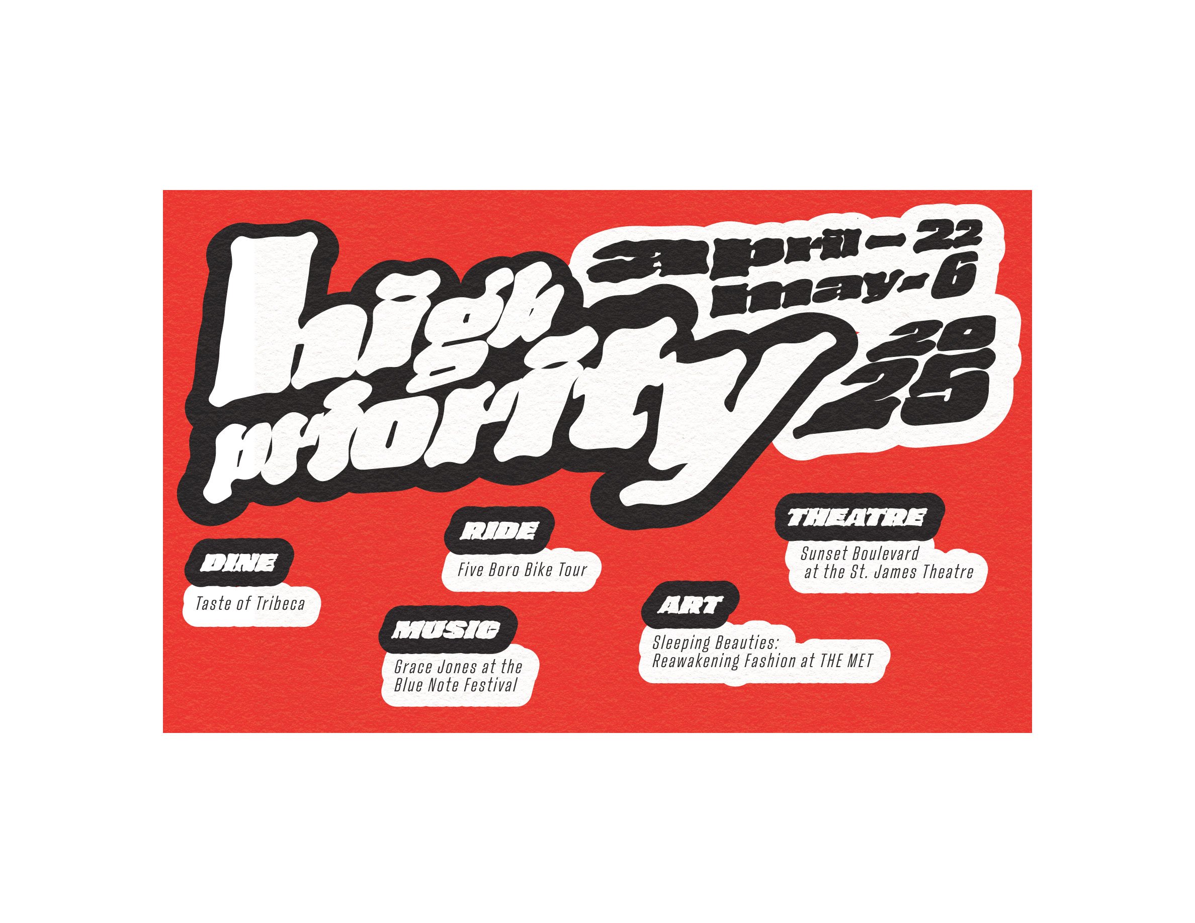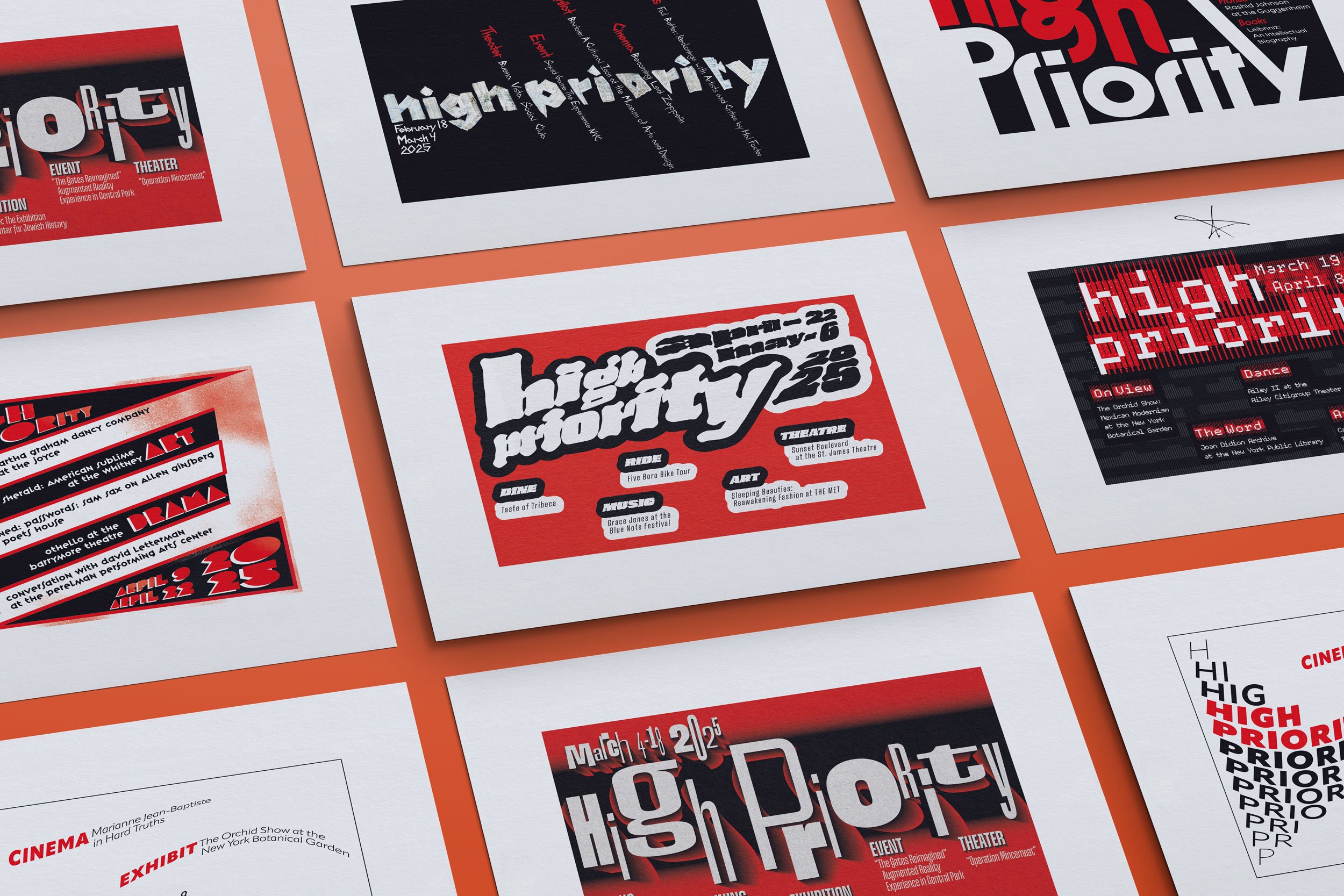
HIGH PRIORITY
High Priority was a typographic design exercise inspired by the frontispiece of New York Magazine’s weekly feature, “The Week.” This project challenged me to explore typography not just as text, but as image—transforming words into visually engaging compositions that highlight must-see cultural events. Through this assignment, I deepened my understanding of type as both an informative and expressive medium, while also expanding my awareness of artists, performers, venues, and cultural happenings. It was a creative exploration that pushed the boundaries of traditional typography and encouraged imaginative visual storytelling.