Typographic Monologue
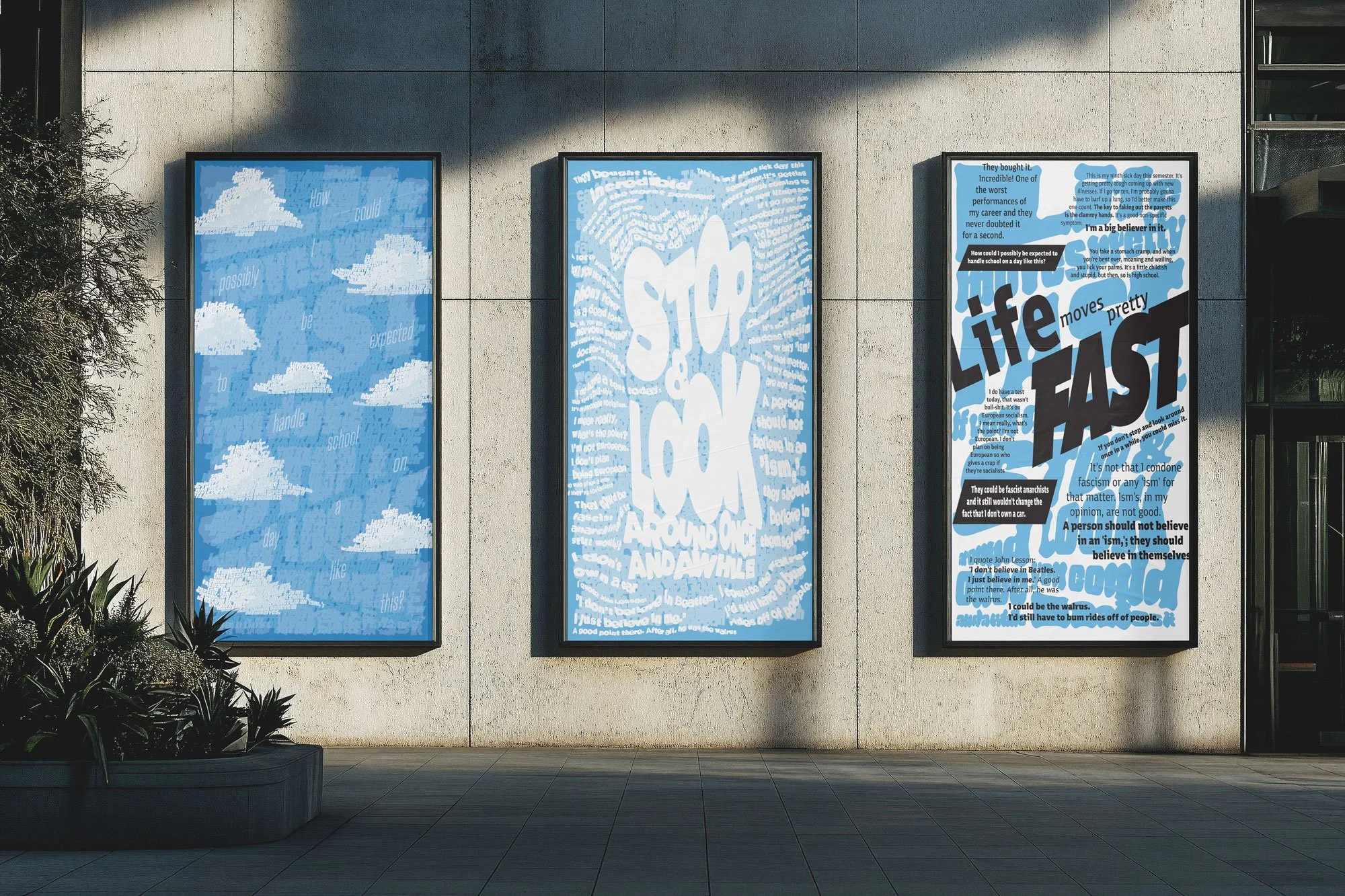
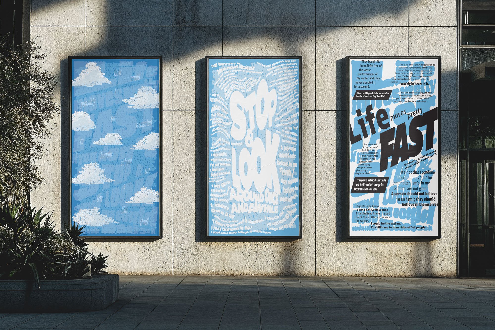
Typographic Communication: Working with a Monologue This project explores the expressive potential of typography as a communication tool, both visually and conceptually. Using a single, 300+ word movie monologue as source material, I designed a series of three 11x17” vertical posters that each approach the text from a different typographic perspective: Type as Text, Type as Image, and Type as Text + Image.
In Part A: Type as Text, I focused on clarity, structure, and typographic hierarchy using a modular or column grid system. Careful attention was given to typesetting rules—line length, white space, leading, and alignment—to ensure the monologue was both accessible and visually engaging. Typeface selection was guided by the tone and context of the monologue.
Part B: Type as Image allowed me to push the emotional and conceptual boundaries of the monologue. Here, typography became the image, capturing the intensity, rhythm, and tone of the speech through expressive manipulation of scale, texture, and composition. Readability was secondary to emotional resonance, and analog techniques and layering were explored to evoke mood and meaning.
Finally, in Part C: Type as Text + Image, I merged both approaches to create a composition that is both readable and expressive. This poster integrates a thoughtful grid structure with visual drama, allowing the viewer to feel the monologue as much as they read it.